6 things every salon or clinic page needs
If your page does not answer in 10 seconds what you do, what it costs, who does it, where you are, and how to book, the client DMs you or leaves. The 6-point checklist that turns interest into an appointment.
Clients do not read your page like a catalogue. They scan it in 10–20 seconds, usually on a phone, between two messages.
They want answers to a few simple questions:
What do you offer?
How much does it cost?
How long does it take?
Who does the work?
Where are you?
How do I book now?
If those answers are missing, one of two things happens: they DM you “are you free tomorrow?” or they close the tab. You either lose time or you lose the client.
Use this checklist on any salon, barbershop, clinic, or studio page.
Quick checklist
Clear services, grouped by category
Visible prices
Duration for each service
The specialist / team
Location + reviews
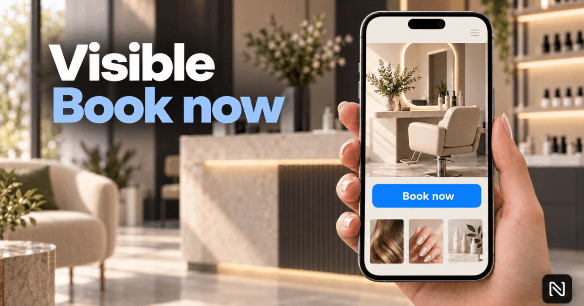
A book-now button that is obvious on mobile
1. Clear, organised services
“We offer manicures, pedicures, and hair” is not a service list. It is a slogan.
A new client wants to recognise exactly what they came for: gel, fill, cut and wash, consultation, treatment, package.
How to do it:
group services by category (nails, hair, face, consultations)
use names people would search on Google or Instagram
highlight 2–3 main services instead of one long list of 40
put packages on their own line (“manicure + pedicure”, “consult + treatment”)
Common mistake: internal names (“gold package”, “procedure 3”) with no explanation. A first-time client has no idea what that means.
2. Visible prices
Many owners hide prices so they “do not scare the client”. In practice, missing prices scare people more. They assume it is expensive, or that they will have to negotiate.
A visible price does two useful things:
builds trust
filters out people who are not a fit
How to do it:
put the price next to each service, not in a separate PDF
if the price varies, show a range (“from €30” / “from 120 lei”)
say what is included and what costs extra
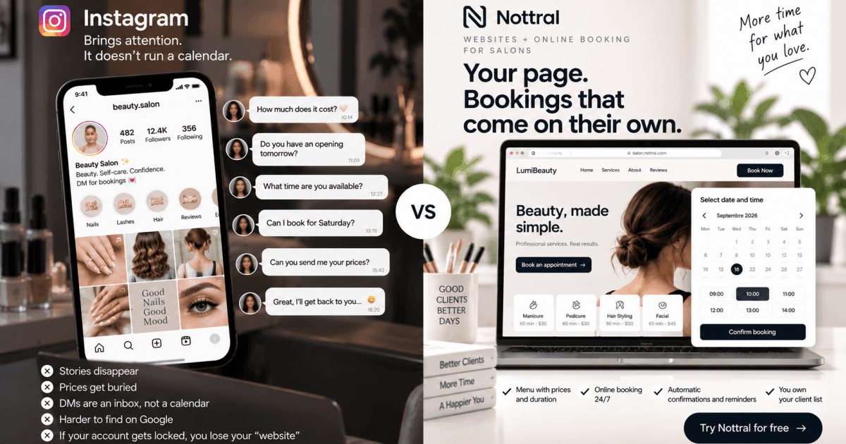
Common mistake: “Prices in DM”. That turns every bit of interest into an 8-message thread.
3. Duration for each service
A 45-minute manicure and a 90-minute manicure are not the same product. Clients are planning a lunch break, a commute, or childcare. If they do not know how long it takes, they ask. Or they do not book.
Duration also protects your calendar: fewer overlaps, less waiting in the chair.
How to do it:
show duration next to price (e.g. Gel — 150 lei — 75 min)
be realistic, not optimistic; finishing early is better than running late
if duration depends on the specialist, say so in one line
Common mistake: one duration for the whole menu. The client cannot tell if they need 30 minutes or two hours.
4. Who does the service
People do not book “a chair”. They book a person. They want to know who cuts their hair, who does their nails, who sees them.
A face, a name, and a specialism reduce the fear of “what will I get”.
How to do it:
name + professional photo + specialism
1–2 sentences of experience, not a CV
if you work alone, introduce yourself; that is enough and it looks serious
let clients pick the specialist at booking if you have a team
Common mistake: blurry group photos, or no information about who is working that day.
5. Location + reviews
“We are in the centre” is not a location. Clients want an address, a map, and a reason to trust you.
You do not need 400 reviews. A few recent, real reviews with a name and a service beat a wall of 5 stars with no text.
How to do it:
full address + Google Maps link
opening hours next to the location
4–6 reviews on the page, not only “see us on Facebook”
parking, floor, intercom — write them down. Those details cut useless messages
Common mistake: reviews only on Instagram, hard to find outside the app. Someone coming from Google never sees them.
6. A clear booking button
This is the piece that turns a brochure into a sales tool.
If the next step is “call us”, “DM us”, or a tiny phone number in the footer, you lose bookings outside working hours. Evenings and weekends are when people decide — and you are not answering.
How to do it:
one primary CTA: Book now
visible at the top on mobile, without scrolling half the page
booking should take under a minute: service → specialist → time → contact details
confirmation and reminder should go out automatically, not from a paper diary
Common mistake: four buttons (Call, WhatsApp, Form, Instagram) and no clear path. Too many options means no action.
Check the page in 60 seconds
Open it on your phone like a new client and answer yes/no:
Do I understand in 10 seconds what you offer?
Can I see the price without sending a message?
Do I know how long the visit takes?
Do I know who I will see?
Can I find the address and one review without leaving the page?
Can I tap a button and book now, not tomorrow morning?
Two or three “no” answers means the page informs, but it does not sell.
What also helps — but does not replace the 6
A gallery, opening hours, a cancellation policy, and a phone number are still useful. They are not a substitute for clarity.
A beautiful page with no price and no booking button still dumps you back into DMs.
Conclusion
A salon or clinic page does not need to be complicated. It needs to answer fast and offer one next step: the booking.
These 6 elements remove most of the friction between “I am interested” and “I booked”.
With Nottral you get them in one place: a presentation page plus online booking, with services, prices, duration, team, location, reviews, and a book-now button. Clients book at night. You stop holding the phone during an appointment.
See what a Nottral page looks like — you can start for free.