What a booking page that actually converts looks like
A pretty page does not book. A clear one does. The structure that takes someone from “I am interested” to “I confirmed the time”.
Conversion on a salon page is not a hero slogan. It is how little the person has to think before they tap Confirm.
If in 10 seconds they do not know what you offer and how to book, the page is a portfolio. Not a sales channel.
The flow that works
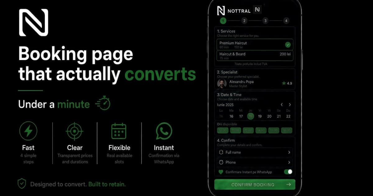
Above the fold: who you are + Book now.
Services: name, price, duration. Not 40 options on one screen.
Specialist: face + name. Optionally, pick the person.
Calendar: real open slots, on mobile, without seven taps.
Minimum details: name, phone. That is it.
Instant confirmation on WhatsApp / email, not “we will contact you”.
The whole path: under a minute.
What kills conversion
a 6-photo slider before any information
“Call to book” as the only CTA
a 12-field form
times that are no longer free
price revealed only at step 4
a newsletter popup over the calendar
The phone test
Open the page one-handed. If the button needs pinch-zoom, if hours live in Stories, the page does not convert. The inbox does.
Conclusion
A converting page is boringly clear: what, how much, who, when, confirmation.
Nottral is built on that flow: presentation + booking, on mobile, with automatic confirmation.