Why your site needs a visible Book now button
If the booking button sits in the footer, below the fold on mobile, you do not have a CTA. You have a secret. Why one clear button beats four contact icons.

People open your page to lock a time, not to admire the palette.
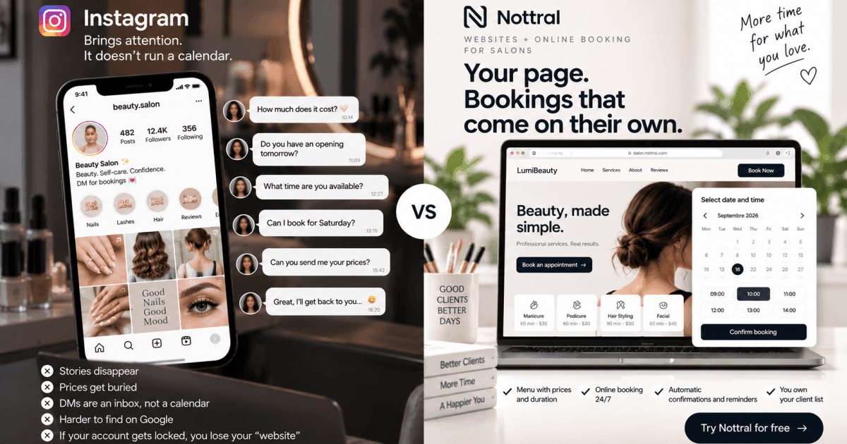
If the first tappable things are the logo, a hamburger, and About, you asked them to work. Many will not. They close the tab and DM Instagram — or leave.
What “visible” means
on a phone with no scroll
high contrast (not grey on grey)
action copy: Book now, not “Learn more”
it opens the calendar, not a Contact form
A phone number in the footer is not a button. Four icons (call, WA, IG, Maps) are not a path. They are a junction.
Where to put it
In the header — it stays while they scroll.
Next to the first services block.
Again after reviews.
Not in 12 places with different labels. The same CTA, repeated where needed.
Why owners hide it
“It looks aggressive.” To the client it is polite: you tell them what to do. Aggressive is making them guess.
“I want them to call.” Then they will call at night, when you do not pick up. The button still works then.
Conclusion
A page without a booking button is an expensive business card.
Nottral puts the CTA on the page and wires it to the calendar. One tap. Confirmation. Done.